Before we get down to the task at hand, a few ground rules:
- We’ve included every professional team on record with the exception of a few that only played for single seasons in the 1950s. There just weren’t any good pictures to judge by, and it’s a safe bet that no one will care about the New Haven Nutmegs.
- Division I NCAA hockey teams are included, as was one notable Division III team.
- Farm teams that make no effort to differentiate their jerseys from that of the parent team get judged by their crappy third jerseys, harshly.
- Teams that actually try get the benefit of the doubt and are judged by their best jersey, as arbitrarily decided by myself.
- Boring is bad.
- Classic is good.
- “Edgy” is the worst.
- My opinions are objectively correct. The science is settled. If you disagree, tell us why you’re wrong in the comments.
21. Danbury Titans
Federal Hockey League
As I was trying to determine criteria for which teams to include, I struggled with the FHL. I don’t consider it a legitimate professional league so much as ponzi scheme. Ultimately, I decided to include the league’s Connecticut teams out of respect for Danbury, an old-time minor league hockey town which deserves better than the glorified men’s league which has set up shop there.
The Titans are the quiet, boring death rattle of a tradition of Danbury hockey which peaked with the Trashers and died dramatically with the sudden exit of the Danbury Whalers. This ugly mess of a jersey exemplifies that slow decline into mediocrity perfectly. It straddles a fine line between boring and garish, and includes a color that has no place on any jersey in any sport anywhere: neon lime green.
The easiest picks on this list were the best and the worst. Hats off to Danbury for making this one so easy on me.
20. New Haven Senators
American Hockey League
Technically a rebrand of the beloved New Haven Nighthawks, the Senators were so unloved and so unremarkable in appearance that I was unable to find a single clear photo of their jersey.
I’m not sure if there’s ever been a more egregious example of a farm team phoning it in. Their uniform and logo were identical to the parent team, and the affiliation lasted only for one season, which happened to be Ottawa’s historically bad 70-loss inaugural season. The New Haven Senators were a little better, but not much. The missed the play-offs with only 22 wins and disappeared forever.
19. Danbury Mad Hatters
Eastern Professional Hockey League
Like the Senators, the Mad Hatters of Danbury were another example of diminished returns in a follow-up to a beloved brand. Unlike the Senators, the Mad Hatters at least tried to acknowledge the beloved Trashers which preceded them.
They just didn’t do a very good job. The logo is a clear rip-off (or homage, if you choose to see it that way) to the Trasher’s anthropomorphic garbage can, but the Mad Hatters had none of the Trasher’s greasy mafia charm to help the cartoon cheese go down. It doesn’t help that the uninspired name was clearly the result of a conversation that went something like this:
Person 1: “I really wish we could just name this team Trashers.”
Person 2: “Yeah there’s that whole federal indictment of the trash pick-up company which owned the team though.”
Person 1: “Oh yeah. What else is Danbury known for besides corrupt garbagemen?”
Person 2: “Uh, making hats?”
Not surprisingly, they were another one-season wonder as the EPHL succumbed to the decline of low-level minor-league pro hockey.
18. Hartford Wolf Pack
American Hockey League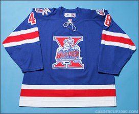
If you know me, you know I showed great restraint in not placing this jersey dead last. Every jersey they put on ice has been, at best, a half-assed knock-off of various Rangers jerseys. But the tenth anniversary jersey was, far and away ,the most hideous thing they wore on a regular basis.
The jersey itself looks identical to a blank Rangers jersey, which would be fine if hating the Rangers wasn’t the only thing that Central/Eastern Connecticut’s mix of Whalers and Bruins fans agreed on. The already garish, oversized and lopsided Wolf Pack logo was made even more cluttered and unwieldy by superimposing it over a giant Roman numeral 10.
Of all of the teams in this list, the theme of unloved successors to beloved teams is probably best expressed in the Wolf Pack. They were the least popular of three options presented to Hartford’s fans while still mourning the loss of the Whalers, inexplicably chosen by the state. Promises from the Rangers that the team “would be its own thing” were broken as soon as they were made, and the Wolf Pack was barely tolerated by a city that had woven the green and blue of the Whaler into its cultural DNA.
This abomination of a jersey came at a nadir of the Wolf Pack’s popularity, and was spectacularly tone deaf. The team’s marketing was downright celebratory as the city mourned a decade of decline and loss. It speaks volumes that less than three years later, the Civic Center damn near sold out to celebrate the death of the Wolf Pack brand.
17. Bridgeport Sound Tigers
American Hockey League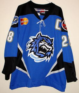
Like their parent team, The Islanders, I don’t hate the Sound Tigers. The team and its uniforms generally fill me with a deep sense of indifference. Most of the jerseys they’ve worn look like Islanders jerseys with the best part, their classic logo crest, replaced with the cartoon face of a Sound Tiger, whatever that is.
That said, according to the rules set out for this list, teams which fail on grounds of originality will be judged by their bad third jerseys. And like most modern AHL teams, those bad jerseys are really bad.
I don’t hate the Sound Tigers, but I sure do hate everything about this jersey, from the color scheme to the “edgy” triangular striping to the MasterCard logo on the chest. It’s not quite as bad as the Danbury Titans, but unlike the Titans who are funded by a car dealership and playing for crowds of less than a thousand in a glorified rec rink, the Sound Tigers are a top-level affiliate of a major-league team.
They have no excuse to look this bad.
16. New Haven Knights
United Hockey League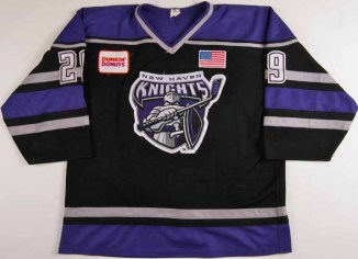
There’s not much to say about the Knights. It’s a decent jersey and logo, neither terrible nor great. They played two seasons of rough, low-skill hockey in the short-lived UHL, a league that scavenged the least-desirable remnants of the IHL, and independent AAA league that dared to steal talent from the NHL and died a swift death as a result.
They are probably remembered most for being the final team to occupy the storied New Haven Coliseum before it closed its doors and was eventually demolished. It was the last stand of the Jungle, AKA Section 14, a rowdy enclave of drunken hecklers who had defined New Haven Hockey since the old New Haven Arena days, where they were known as “The Zoo” and chain smoked cigarettes behind chicken wire at Blades games. Something like it was resurrected in Danbury by the Trashers and lived on through the Danbury Whaler days, but it was a tradition spanning decades and died with the Knights, for better or for worse.
These jerseys aren’t as interesting as that tradition. But they’re okay.
15. Sacred Heart Pioneers
Atlantic Hockey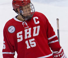
Meh. They didn’t try with these jerseys, so why should I?
Sacred Heart is the one Division I school that everyone keeps forgetting exists, and they have uniforms to match.
14. Yale Bulldogs
Eastern College Athletic Conference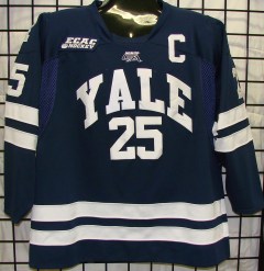
There isn’t much to say about this one. It’s clean and simple almost to be the point of being boring, but it’s hard to fault an Ivy League team that has been putting a team on the ice since 1893 for leaning so heavily on tradition.
They play inside a giant wooden whale and sell out every game, so they’ve got that going for them.
13. Danbury Whalers
Federal Hockey League
This is a weird one. There is nothing original about this jersey, and replacing the timeless Whalers logo with a big asymmetrical “D” that lacks of the cool factor of the hidden negative-space “H” from the original logo sure doesn’t make it better. Nor does the Buffalo Wild Wings patch on the shoulder.
There’s a weird charm to this jersey in spite of the total lack of originality. The FHL is and always has been a ponzi scheme, a small core of 2-3 teams anchoring a league that has no working business model, while an endless series of new teams joins the league each season and infusing it with cash via expansion fees. Those teams typically last a single season before the poor sap paying the bills pulls the plug.
Herm Sorcher was a sincere Hartford Whalers fan, and the homage of these jerseys came from the heart. It was a kind of madness to beat the odds and bring back the Whalers in some small way through this mess of a hockey league, but I can’t fault him for wanting to do so. His partner, Alan Friedman, was the less charming of the two. Many folks, this writer included, had the pleasure of receiving unprovoked messages full of expletives and threats for criticizing the team’s questionable business practices publicly. After one such exchange with Alan, Herm found me in a crowd at a UConn game despite never having met or spoken directly, just to say hi and shake my hand. I’m still not sure if the gesture was meant to be friendly, threatening, or some combination of the two.
Something about that ambiguously ominous encounter neatly sums up Danbury hockey to me.
12. Danbury Trashers
United Hockey League
Sometimes it’s impossible, for better or for worse, to separate the jersey from context. In the case of the Trashers, it works strongly in their favor.
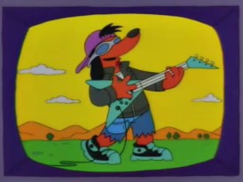
Everything about this jersey suggests that I should hate it. Above all else, I consider attempts at edginess to be the cardinal sin of hockey branding. Hockey is the uncool fourth (possibly fifth) wheel of major league sports, the traditional past time of dorky rural Francophones from the middle of Bumfuck, Canada and various New England mill towns. The first thing that comes to mind when hockey teams try to be cool is Poochie from the Simpsons. Tradition works. Double down and you can’t go wrong.
Somehow, the Trashers still make me smile. That might be because unlike the many trying-too-hard dorks before him, James Galante really was kind of a bad ass. He used no-show mob trash jobs to circumvent the salary cap and stack the Trashers with talent that had no business in low-level minor league hockey, including Wayne Gretzky’s brother Brent. Galante once punched a linesman, got charged, and made the case mysteriously disappear when the linesman suddenly got forgetful. The team dissolved after its second season as a result of a federal indictment, but it’s the rare Danbury fan who doesn’t remember those days fondly and speak of Galante in reverent tones typically reserved for priests and saints.
So yeah, the cartoon trash can is kind of dumb. But I can’t look at it and not think about the insane story behind it.
11. University of Connecticut Huskies
Hockey East
Full disclosure: I’m a UConn season ticket holder and unapologetic fanboy. This team is second in my heart only to the might Whalers of yore, and I won’t even pretend to be unbiased.
That said, their current uniforms kind of suck.
I’m not a fan of the new husky logo, famously dubbed “Rape Husky” by overzealous women’s studies majors upon its debut. I really hate the addition of red to the color scheme. I’m sure some marketing genius did dozens of studies proving that this will help merchandise sales, and he’s probably right, but I’m not a fan. The uniforms they wear now are supremely generic, a case study in being unmemorable.
Prior to this unfortunate direction they had a series of great uniforms with the classic navy blue, white and silver color scheme, and so according to the arbitrary rules I’ve laid out, that’s how they will be judged here. Pass the jalapeño mac and cheese.
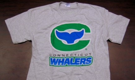
10. Connecticut Whale (AHL)
American Hockey League
This is another one that leans heavily on context. Howard Baldwin’s original plan called for a far more traditional look and brand, but forced to execute the rebrand mid-season, he opted not to dispute ownership of the Whalers name and logo with the NHL. Instead of the Connecticut Whalers, we got the Whale. Instead of a modified Whalers logo, we got a cartoon whale that was decidedly not Pucky and weird waves in place of the classic striping.
However, it’s impossible to separate the introduction of this jersey from the optimism of its debut in 2010. After 13 bad years under Madison Square Garden, we finally had management that was dedicated to Hartford in old friend Howard Baldwin. The uniforms weren’t perfect, but they got the colors right. The Rangers patch on the shoulder isn’t my favorite, but for a brief moment it was a symbol of hope that everyone might be able to get along after all.
That spirit lasted exactly one season, but it was a good year. I think of that year when I look at this jersey.
A prototype for the much cooler logo that never got used.
9. Quinnipiac Bobcats
Eastern College Atheletic Conference
Quinnipiac isn’t the sexiest hockey program in the state by a long shot; it’s kind of a fluke that they’re even remotely notable. QU is a tiny college isolated on top of a hill in a boring patch of central Connecticut a bit north of New Haven. Before their hockey team started going on 20-game winning streaks and making it to the national finals, the school was best known for it’s electoral polls. (Again, not sexy.)
Their uniforms are a lot like the team which wears them: a flawless, efficient machine. I can’t say anything bad about a team that wins so much they get bored of winning, and goes on a 200-minute shut out streak to spice things up a bit. The logo is a classic college animal logo, with a clever allusion to the letter “Q”. The underused blue and yellow color scheme stands out, and all of the design elements from the crest lettering to the striping are classic and understated. They’re not my team and never will be, but they’re impossible not to admire.
8. Beast of New Haven
American Hockey League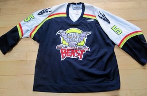
Everything about the Beast, from the Yodaesque syntax of the name to the crudely hand-drawn logo, is off-kilter. Fittingly so, as the circumstances surrounding the team’s brief run were themselves rather odd.
Longevity has born out the Wolf Pack as the de facto successor to the Whalers, but they were only one of two AHL teams to enter the Hartford market in 1997. And for two years, amidst the gaping psychic wound of the departed Whalers and a tangled web of allegiances and old wounds, the Beast and the Wolf Pack waged civil war.
The Wolf Pack was, for better or worse, Hartford’s team. They called the Civic Center home and courted the same fans, though many were simply unable to adopt a former hated rival as their new parent team. Meanwhile, New Haven had hockey again for the first time since the disastrous experiment of the Senators killed the Nighthawks. For the many people who lived somewhere between the two cities, there was suddenly choice. And it was further complicated by the origin of the Beast.
In 1996-97, the Beast had been known as the Carolina Monarchs of Greensboro, North Carolina. The sudden departure of the Whalers to North Carolina displaced the Monarchs, who ironically found themselves occupying a vacancy in Connecticut. While then as now, many Whaler fans were reluctant to support the Hurricanes, back then the connection was much closer and wounds still raw. The Hurricanes weren’t the Whalers any more, but they were a lot closer then than they are now. Kevin Dineen, the heart and soul of Hartford, was still captain. It was hard not to see the Beast as a direct connection to what we’d just lost, and for many people that connection was the lesser evil when compared to rooting for a hated rival whose fans had been gloating about the Whalers relocation just a year earlier.
The Beast is largely forgotten today, and that’s too bad. It was weird and cool and the kind of thing that isn’t allowed to exist in pro hockey anymore.
7. Connecticut Whale (NWHL)
National Women’s Hockey League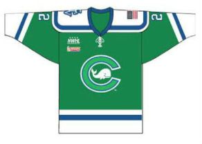
A last-minute uniform change bumped the NWHL Whale up quite a few spots. Like the AHL Whale, the Lady Whalers struggled with trademark issues for several months before finally settling on their current logo. The original logo was very similar to the one which the AHL Whale was forced to scrap. They then adopted the logo of the AHL team with the blessings of the Baldwins, but ran into additional trademark issues and had to reboot yet again. They settled on something I like a little bit more than the AHL version, but a lot less than the classic NHL version.
The uniforms from the inaugural season left a lot to be desired. The primary color was a bright royal blue, and the strange wavy striping which I never liked in the AHL design was emphasized.
If they’d stuck with that design, I’d probably be dialing the Whale in around #13 or so, but a few weeks ago they rolled out a new jersey contest in which this sweet, classic look was one of two options. The other option was not quite as nice, but my guess is nostalgia will win the day on this one.

Logo of the Chicago Whales, a forerunner of the MLB Cubs and probable inspiration for the NWHL Whale logo.
6. New Haven Blades
Eastern Hockey League
The Blades have become something of a footnote to the Nighthawks, who replaced them when the New Haven Arena was replaced by the Coliseum and the EHL splintered into several leagues, one of which was the NAHL upon which the film Slap Shot was based. They played tough, old-time hockey with a timeless uniform to match. It’s a shame that it’s been relegated to the deepest recesses of our hockey history, but that speaks to the depth of that history.
Little-known fact: When the AHL came to New Haven, the Blades moved to Springfield where they became the New England Blades, minor-league affiliate of the New England Whalers, then based in Boston. Springfield had also just completed work on a brand new AHL arena however, and the Blades were unable to compete with the Indians. They folded before their first season was over.
5. Trinity Bantams
New England Small College Athletic Association
Hartford has a national championship winning hockey team, and you’ve probably never heard of them. Even if you live in Hartford.
Trinity is a tiny liberal arts college in the middle of Hartford. Before the men’s hockey team won the Division III title, most of us knew them only by the sign on I-84 boasting about their 254-game Squash winning streak, a record for any and all intercollegiate sport.
The logo is a chicken drawn by a student in 1873. The colors evoke the iconic Colt building. I don’t think anyone besides myself ever has ever ranked them so highly on any list of this sort, if at all. But the Bantams hit my sweet spot of weird, obscure and classic so here they are.
4. New Haven Eagles
Canadian-American Hockey League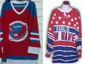
The Eagles were the first pro team in New Haven, forming in 1926 and running until World War 2 forced them to disband. They had the distinction of being a founding member of both the CAHL and the modern AHL.
There isn’t a ton of information about them on the internet for obvious reasons, and they’re even less remembered than the Blades that followed them. All I know is that their sweaters had a great pre-original six look to them, and they are unique in Connecticut hockey history.
Looking at these beautiful old sweaters makes it physically painful to scroll back and look at some of these garish, modern abominations. There’s no comparison.
3. New England Whalers
World Hockey Association
Yup, I’m cheating. I don’t care. The New England Whalers and Hartford Whalers may have been the same team, but they had two (three if your count the nineties) very distinct periods, and other than Pucky and the color green there isn’t a lot of similarity between the WHA and NHL jerseys.
The brilliance of Peter Good’s Hartford Whalers logo and its use of negative space give that incarnation of the Whaler identity a slight edge in my eyes, but there is something almost regal about this jersey. It might be that Gordie Howe had a few damn good years in it, or the gold accents that disappear in the NHL years. It’s not the first thing people think of when you mention the Whalers, but for me it invokes a great era in Hartford history.
2. New Haven Nighthawks
American Hockey League
Just like their northern counterparts, the Springfield Indians, the Nighthawks were iconic stalwarts of the AHL in an era when affiliates were still secondary to a team’s identity. It’s fitting and somewhat ironic that the Hawks were killed by a parent team’s foolish inclination to define the identity of their farm team from afar.
Probably because of my age, I have always associated the Nighthawks with the black and silver of the LA Kings, but they went through several affiliates and color schemes over their lifespan. It never really mattered. While the Nighthawks are easily the best known of New Haven’s many teams, their logo is still criminally underrated. It’s better than many current NHL logos, including that of the team which killed them, the Ottawa Senators.
It took exactly one season of the rebrand as a clone of the historically awful Ottawa Senators to kill the Nighthawks. In hindsight, having lived through and written about the circumstances of the Whalers relocation, you have to wonder if this was intentional.
As cool as this logo is, it’s only the second best logo in Connecticut hockey history. We’re kind of spoiled that way.
1. Hartford Whalers
National Hockey League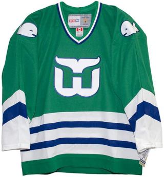
Did you really expect anything else?
There were a few different incarnations of this jersey. The Pucky patches were axed from 1985 into the nineties, and a dramatic redesign in 1992 changed the primary color from kelly green to navy blue, which was then darkened further until almost black in an attempt to ape the successful LA Kings rebrand.
There’s some disagreement about this even among Whaler fans, but for me the original classic jersey will always be the best. They got it right the first time, and the fact that it’s still one of the best-selling NHL jerseys a full 30 years after being retired backs up my point quite nicely.
We never won a damn thing in this jersey. I’m not sure if we even made it to the first round of the play-offs before the amended Puckyless version went into circulation. But it was good enough for Gordie Fucking Howe and it was good enough for Bobby Hull and Dave Keon and Ron Francis. This logo and jersey are so damn good that they transcend not just hockey, but sports. People who never saw the Whalers play hum the brass bonanza and wear this logo.
It was, by all accounts, a happy accident. They set out to have a modestly successful hockey team in a small market and created an enduring cultural icon instead. It’s a great fucking sweater and that’s all there is to say about it.
Exile on Trumbull Street and Connecticut Hockeyviolence (https://www.facebook.com/cthockeyviolence/) are labors of love. Hosting fees and social media advertising are paid out of pocket, and we spend a lot of both time and money preserving CT Hockey history and raising awareness to Make Hockey Great Again. Any and all donations are a huge help.
CLICK HERE TO SUPPORT EXILE ON TRUMBULL STREET:
[paypal_button hosted_button_id=”BTBZQA8BS76NG” img_src=”https://www.paypalobjects.com/en_US/i/btn/btn_donateCC_LG.gif” img_alt=”PayPal – The safer, easier way to pay online!”]
Or, while supplies last, we’re selling these awesome shirts to benefit the site:

Those top two bring a tear to my eye remembering all the great times of my youth and teen years. So sad. Two logos and brands that smoke just about everything out there today. Thanks for taking a flyer and ranking the Beast so highly! I appreciated the risk David Gregory took and was a season ticket holder for the two years of neon, red, and blue. Good times
LikeLiked by 1 person